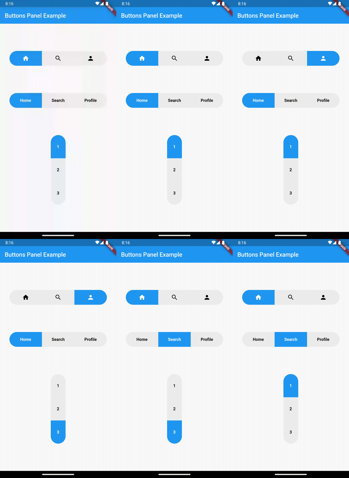
Buttons Panel is a Flutter plugin that lets you create a row/column of buttons that appear as if they're connected in a single line. It gives the illusion of a unified widget, but users can still choose one of the options by tapping the button of their choice.
-
Button Panel: Create a panel containing multiple buttons for users to interact with.
-
Customization: Customize the appearance of the buttons, including colors, text or icons theme, selected item theme background colors, etc.
-
Callback Functions: Set callback functions to handle user interactions when buttons are pressed.
-
Flexible Layout: Easily integrate the Buttons Panel into your app's layout and design.
To use this plugin in your Flutter project, add buttons_panel as a dependency in your pubspec.yaml file:
dependencies:
  buttons_panel: ^0.0.1  # Replace with the latest version
Then, run flutter pub get to install the package.
Import the package in your Dart code:
import 'package:buttons_panel/buttons_panel.dart';Create a Buttons Panel widget:
ButtonsPanel(
  currentIndex: _currentIndex,
  onTap: (value) => setState(() => _currentIndex = value),
  children: const [
    Text("Home"),
    Text("Search"),
    Text("Profile"),
  ],
),
For more detailed usage and customization instructions, please refer to the example.
We welcome contributions to Buttons Panel Flutter Plugin! Feel free to open issues, create pull requests, or provide feedback to help improve this package.
This package is distributed under the MIT License.
